
if somebody, anybody, out there is reading this, i’d love a second opinion, third opinion would be nice fourth or even twelfth would be great, but i won’t get my hopes up lol.
i’ve done a few changes to the layout, both here blogguerz and over at my homepage guerz.lol
the blogguerz
here at blogguerz, i’m trying out a new title font which i gotta say i was unsure of at first, but the more and more i visit this page, it’s growing on me. reason i chose it is cuz i really, really like it’s lower case g’s.
i got rid of one of the Jeffrans (penguins) in the header on either side of the title, and just one lone one. that guy will never outlive his stay. it’s a goddamn penguin after all, penguins have a forever home wherever i go.
with the background color, i set it to the lavender, same lavender from the boxes on guerz.lol cuz stylistically i’m trying to and have the blogguerz layout be complimentary to guerz.lol. i have both open side by side right nowin a browser window, and i think they both go pleasantly together.
layout-wise, blogguerz is virtually the same. i still gotta get around to sitting down with each and everone of the templates so i can customize tweak them using the powers of my OCD habits.
and as stated at the top: if anybody’s reading this, lemme know what ya think!
the homepage
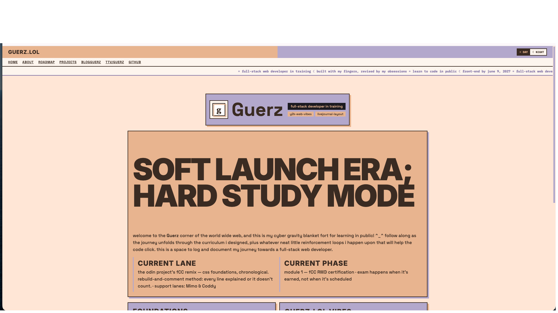
over at my homepage, guerz.lol, i did a FUCK ton of changes sitewide.
on the landing page, i got trimmed down a lot; got rid of a bunch of text, cuz i thought about my dyslexia and my arch nemeses (walls of text) and realized my landing page is a giant greek threshold covered writing. so i dialed it back, way way back. less is more, especially for first experiences. keeping it simple really makes a difference.
i also added to the homepage a working guestbo- err… i mean, GuerzBook. i encourage any and all who visit to, please, sign the GuerzBook at the bottom of the homepage! write whatever you want, sharing your thoughts or just to say “hi” or to make suggestions to the layout or what have you. obviously, just don’t say anything stupid, thanks!
colorwise, i have an alternating peach/lavender pattern with the boxes, border shadows being their complimentary “opposite” as well. this pattern you can see applied across each page. the main background color i dialed down the tone, trying to make it a bit warmer and way less flash-bang-y. i think it works out nicely.
there’s day/night mode too. you can toggle in the top right of each page, day mode being the default.
in the Projects page, i made all 3 sections and their subsections into collapsable titles. i updated context at the top to better reflect what all is going on at that page. i also slapped the same flashing “under construction” banner at the top that you see on the homepage since that’s the accurate depiction of what’s going on there; still working my way through building the freeCodeCamp – RWD v9 Build Archive.
only thing left that i want to get to on guerz.lol is update the homepage context.
i got a fuck ton finished all of yesterday for my fCC – RWD v9 Build Archive: Forms and Tables, and Accessibility. so after writing this, i’ll begin cracking open Basic CSS, which is the bulk of the uploads. my body is ready.

ever since learning about accessibility, things have truly opened up my eyes about the importance of inclusive design and how it can positively impact every one’s ability to participate in society and make technology usable for everyone, regardless of their physical or cognitive needs.
soooo yeah, like i said at the beginning, if any of ya’ll are reading this, please, any sorta input would be much appreciate, i’d love to hear your thoughts! thanks! ^_^
current mood: 🤠 hella giddy af
currently listening to:
Comment: